TWICE 2.0 — Coming soon.
Learn more about the update

A website is essential for success if you're in the party rental industry. Your website is a hub for your online marketing efforts and establishes trust with potential customers. Moreover, by integrating party rental software and payment processing tools, your website can attract and convert website traffic into paying customers, helping to keep your business busy year-round.
Understanding the benefits of a website for rental businesses is one thing; putting them all together is another. That's why we're here to help you build a party and event rental website that converts.
When it comes to a party rental website, there are a few essential aspects to consider. Firstly, it should effectively display your brand and your various services. However, the most vital function of the website is to provide customers with a seamless and efficient way to book the necessary supplies for their upcoming party.
Even though the internet provides shoppers with the necessary information to compare various options, they are often too lazy to do so. As a result, companies prioritizing creating user-friendly websites that make it effortless for customers to accomplish their objectives tend to come out on top, regardless of whether or not their service is superior to their competitors.
Individual website pages are your tools to convey all the critical messages to your website visitors and convince them to commit as customers. Here's a general guide to the most essential pages a website should have.
Next, let's discover how to turn your vision into a stunning party rental website.
Starting a rental business of any kind requires an investment of capital. In the past, a website was one of the biggest outlays for rental companies. If you wanted to open an online store, you had to pay a web developer thousands of dollars and hope they translated your vision into a functional and easy-to-use site.
However, the emergence of website builder platforms changed everything. These services allow non-technical business owners to build websites using drag-and-drop interfaces and templates. These tools have become highly sophisticated recently, with some even offering AI to help you develop your site.
Here are some of the most used website builders on the market today.
Once you've picked your website builder, you need a domain name and somewhere to host your party and events rental website.
Scout around for available domain names. You can search indexes like GoDaddy to see which URLs are free. Try and find a domain that closely matches your company name, where possible.
Next up, you need a web host. What you're buying here is server space. While there are many different hosts to choose from, consider using a service with servers near your client base. It can result in better speeds and an overall quicker website.
Fortunately, this has all been made easy because many website builders offer all-in-one deals for domain names and web hosting services. So shop around and see which one provides the mix of features and pricing that you need.

Once you've got all that out of the way, it's time to design a party rental website that will generate some visitors and sales. However, conversions won't just fall into your lap. You need to work for them. Thankfully, if you follow these best practices, you'll have a great site in no time.
The first thing you need to consider is the overall aesthetic. Your choices will depend on things like your brand and your target audience. Parties can be exciting, playful, casual, elegant, and basically whatever your customers want. So, the colors and design elements you choose should reflect that. Just think about your audience and their expectations. If you're shooting for a sophisticated crowd, then an elegant palette and classy font will work. On the other hand, if your target market consists of kids (or their parents), then try bright and bold colors alongside some upbeat font.
Of course, making things look good is just one part of the design. User experience is another essential part you need to consider.
User experience describes how your users feel when they interact with your website. It covers many things, from the overall look and feel to how easy it is to navigate and find information.
Building a strategy for a solid user experience for your website starts with understanding what your target market wants and how they expect to purchase party rental services online. Do as much research as possible into your target market, and find out about their expectations, pain points, needs, and objectives.
Here are a few things to consider.
Good website useability is about simplicity and clarity. It's a minimalist approach that discards anything that is not strictly necessary and keeps only the elements that help your users achieve their aims. In this case, that means booking party rental equipment.
Users don't visit a party rental site to marvel at the design. Sure, it's a nice bonus, but what they want is to find products, services, and other information quickly and easily.
Website navigation has a considerable bearing on user experience. If your prospects can't find their way around your site quickly, they won't stick around. On a basic level, your website is a repository of information. Users who enter your site want to find information without any friction.
The right combination of headers, footers, sidebars, internal links, and search bars allows your users to locate the pages and products they need to view to convert. Ideally, any page on your website should be only one or two clicks away.
Modern websites have a lot of pages, and party rental sites are no different. Each product you rent might have its own page, so you need to put some thought into how each page is managed and categorized. A good website structure uses a hierarchy that flows from your main page.
The final step of your user flow is where your customers pull the trigger and either book your products or send you a message.
Now, there are two main ways that party rental businesses can let their customers book. The first is the more traditional contact form. In essence, your user fills out their details and makes a request. As explained earlier, perfect for more complex customer needs.
Direct online bookings are superior for simple orders where the customer's need is clear. They provide less friction and let your customers move at their own pace. Moreover, it helps you reduce customer service interactions, freeing you up to do other tasks.
Once the structural elements of your website are sorted, it's time to think about content. The best way to approach this part is to consider the different pages your website should have and what type of creatives (copy, images, etc.) you need for each page.
Let's break down both categories.
A good party rental website needs a few core pages. Here is a list of the essentials.
A well-structured and easily navigable website is nothing without impactful creatives. If you want to convert users, you need great copy and images.
Copy: Clear, well-written, and punchy copy is a must for your party rental website. It's a way to let users know what you're about, communicate your brand values, and ensure your customers understand your USP. Use friendly and inclusive language that conveys the qualities your customers want to find in a party rental website.
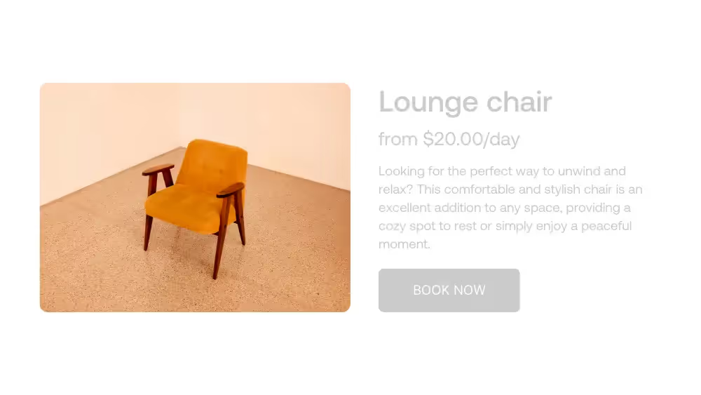
Product descriptions: A website is a digital showroom. While your users can't walk around and look at and feel your products, you can bridge the gap with great product descriptions and high-quality photos (more on that below).
Product photos: Good quality product photos have a significant impact on conversions. Individual product pages are an opportunity to include pictures that sell the quality of your inventory. Good lighting, clear backgrounds, and a mix of portraits and close-ups will assure your customers of your products. Don't be afraid to mix in a few products showing people using your equipment; they'll also help your users picture themselves using them.
Once you've taken care of design, hosting, and creatives, it's time to move onto an important stage: ensuring your site can take online bookings. Customer self-service is a growing trend. Thankfully, a few 3rd party integrations allow you to manage bookings and take payments.
Here are the two key integration tools you need.
Rental software is critical for your party rental business. These software tools help you keep on top of your inventory levels, inform customers about availability, and track where your products are at all times. A few tens a month for clear visibility of your business and hours of time saved is a pretty good deal.
The payment processing system is another essential aspect of online bookings. It allows you to take different payment types and charge deposits. With Twice, you'll get all the tools to accept payments how, when, and wherever you need.
Before you go live, there are a few more things that you can do to improve your party rental website. Use this checklist to ensure your site is ready to go.
Other party rental websites are a great way to learn about the best practices of website site design. These sites can inspire and guide you on what works and what doesn't.
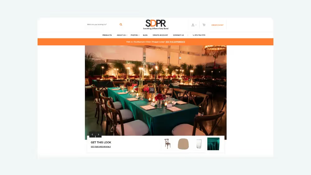
Something Different Party Rental is a NYC-based rental business focusing on seating, glassware, and linen. Their website uses an elegant opening image, social proof, and easily accessible categories to display their products. It's easy to navigate and find what you want, which is why it makes our list.
Allens Hire is an award-winning London-based party rental business. Their website packs a lot of information on the home page without feeling overwhelming. Product categories are broken down into easily navigable headers, while a carousel shows off images of their various products.
Take a look at their "Get inspired" section. Booking is made easy with a visual gallery of different styles and ready-made product lists for each style.

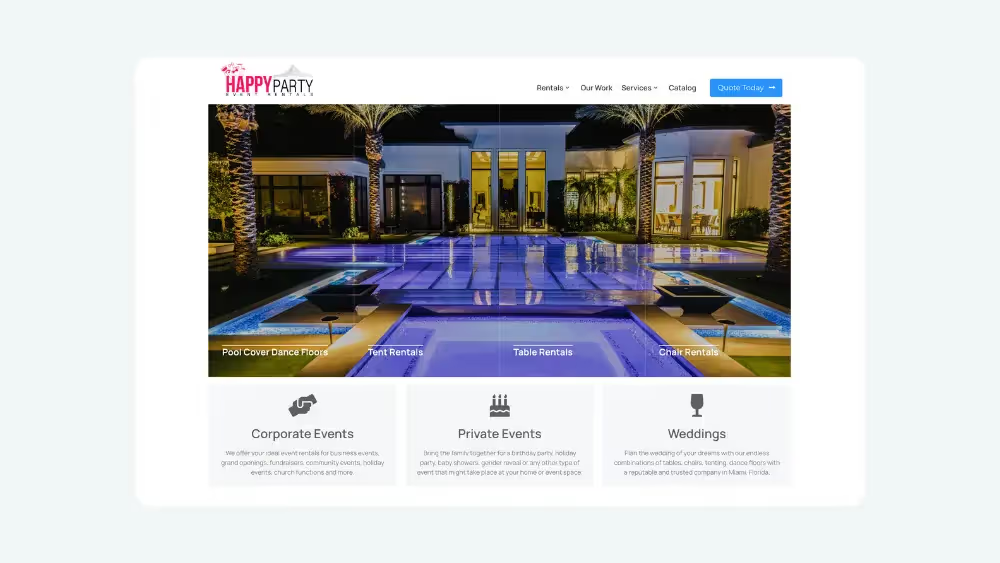
Happy Party Rental is based in Miami. They specialize in tables, chairs, tents, and pool covers. Their target audience is upmarket, so they use high-quality professional photography and social proof. All their products are accessible from their drop-down headers, making browsing their extensive inventory a doddle.
A great party rental website has several different functions. It's a way to attract customers through online marketing and search engines, a digital storefront for your services, and an effective method to establish credibility for your business.
Building a rental website is more than making your site look aesthetically pleasing. The user experience should be at the forefront of your thoughts when designing a website for your party rental business. Your site should be easy to use and navigate and show the content and elements your prospects need to convert.
Using these guidelines, you can start building your business website. Take a look at some YouTube videos to get you started. And, of course, we're happy to help, too.
Turn every item into lasting revenue. Explore TWICE with a free trial.