TWICE 2.0 — Coming soon.
Learn more about the update

There's a lot that goes into building a good website these days. The structure, layout, images, copywriting, and performance are huge factors in your site's success. However, website navigation is pretty close to the top of the list when it comes to a single factor that has the most significant impact on the overall user experience.
Easy, intuitive, and effortless navigation will make browsing and shopping that much easier for your customers. On the other side, a lousy navigation system could turn them off. So much so that they might abandon your site altogether.
So, if you want to keep people on your site longer, grow e-commerce sales, and turn visitors into customers, it's time to make sure your website navigation follows the best practices. After reading this blog post, you'll understand the importance of website navigation and the pieces you need to build a user-friendly navigation structure.
User experience refers to the perception of how visitors feel using your website. Many factors influence user experience, but website navigation is undeniably one of the most critical areas of web design.
A website can have beautiful looks and exciting content, but both are pointless unless users find what they want. And this is where website navigation comes in.
Before designing your navigation structure, you have to predefine your site's information architecture because it is the foundation for your navigation system. You can imagine the site structure as the roads and the navigation items as the road signs that help the website visitors navigate to their desired destination. You can't place the road signs before knowing where the roads go, right?
We're talking more about site structure and information architecture in this blog post.

It is worth pointing out that there's a certain way people are used to browsing websites. Therefore, when designing website navigation, it is essential to respect user habits. Ever since most of us first started surfing the web in the 1990s, we've learned to do things and search for information on the Internet in one way. This is not the time to reinvent the wheel.
While you might be tempted to do something unique, you're probably just going to frustrate your users and send them elsewhere. In that sense, we are rooted in our customs.
Make your site interesting and your service ground-breaking, but keep it standardized when it comes to website navigation. People know where to find it, expect to understand how to use it, and have no patience when things don't go as planned.
So, keeping that in mind, let's move on to website navigation elements.
Website navigations are built with different parts. All the parts have a different role in improving your site's usability. In the following chapters, we introduce the most common website navigation elements.
Header navigation is the most common navigation type on any website, and typically it's the website's primary navigation. It's a navigation bar that stretches across the top of the screen, listing the site's main pages and making it easy for people to find the most important content on your site.
If you look at a site like Amazon, they have links to all the major categories, a quick search option, links to your account, and a log-in option. Users can access most of the content they are searching for on Amazon's website from the main navigation bar, so they never have to scroll or look for those things.
The header navigation can be fixed or scroll with the user. While the latter can be convenient, you should ensure the sticky header doesn't cover too much of the page. Above the fold is your site's most valuable real estate, and you don't want to fill it with too large navigation menus. Adding a floating "back to top" button can be a good idea for pages with a lot of scrolling.
%252520(1200%252520%2525C3%252597%252520400%252520px).avif)
Amazon uses two-part header navigation on its website. The system-level navigation includes menus that allow the user to shape her preferences, affecting the overall shopping experience. The secondary menu contains links to product categories, deals, customer service, and other sections of the website that are critical for Amazon's business.
We usually can't fit everything on a single navigation menu. Therefore, you probably need sub-navigations to complement the header nav bar.
These could be dropdown menus from the main menu, which appear when a user hovers the mouse on top of a menu item, or they could be submenus on each page the user visit. Most sites use a combination of both so that it's easy for people to find what they want either from the dropdown menu on the main page or from the submenus on each page.
Try to organize your pages and content so that your website navigation structure doesn't have too many menu levels. As much as it lets users drill down, they might get bored trying to find an obscure item or page and decide to look elsewhere.
Websites with many hierarchical navigation links can add breadcrumbs to ease site visitors finding their way back from the deeper pages. We'll tell you more about breadcrumbs a bit further in the text.
%252520(1200%252520%2525C3%252597%252520400%252520px)-1.avif)
On the 'Today's deals' page, the sub-navigation includes links to coupons, renewed deals, outlet, warehouse deals, digital deals, and Woot! deals pages. Furthermore, there are links to offers in different product categories.
The footer menu is the section you can find at the bottom of a web page. It is usually reserved for site policies, refund and return information, help & support, contact details, and links to social media. For ecommerce websites, these links are mandatory but secondary in driving users towards conversions and increasing sales.
Another way to utilize footers is the so-called fat footer approach. These kinds of footers include more links to the important pages or sections on your website. You can, for example, add links to useful resources or the most popular product category pages into the footer.
%2525201.avif)
The footer navigation includes links about the company, partner opportunities, and additional resources, including the policy and support pages.
Sidebars are navigation menus that allow people to find additional information and pages directly from specific pages on your site. Sidebars often include secondary navigation links that enable users to browse deeper into the website.
So, for instance, sidebar navigation on a category page may include navigation links to subcategory pages. Furthermore, a common practice is to add filters and product specification options in the sidebars. Usually, designers place vertical navigation menus on the left-hand side of the page.
%2525202.avif)
Amazon utilizes sidebars as a part of its main navigation. They have so many product categories that they've been forced to group them under a hamburger menu.
CTAs or Calls to Action are vital for any website, particularly in e-commerce. CTAs are navigational element that encourages users to take the desired action. CTAs can, for example, be buttons that bring users to a particular section or page, banners with a coupon or an offer, newsletter sign-up forms, and buttons that encourage users to add the product to their shopping cart.
Some websites use pop-ups to make users aware of deals and offers. All forms of call-to-actions are designed to funnel users to web pages where they are most likely to make a purchase or other action that has value for the website owner.

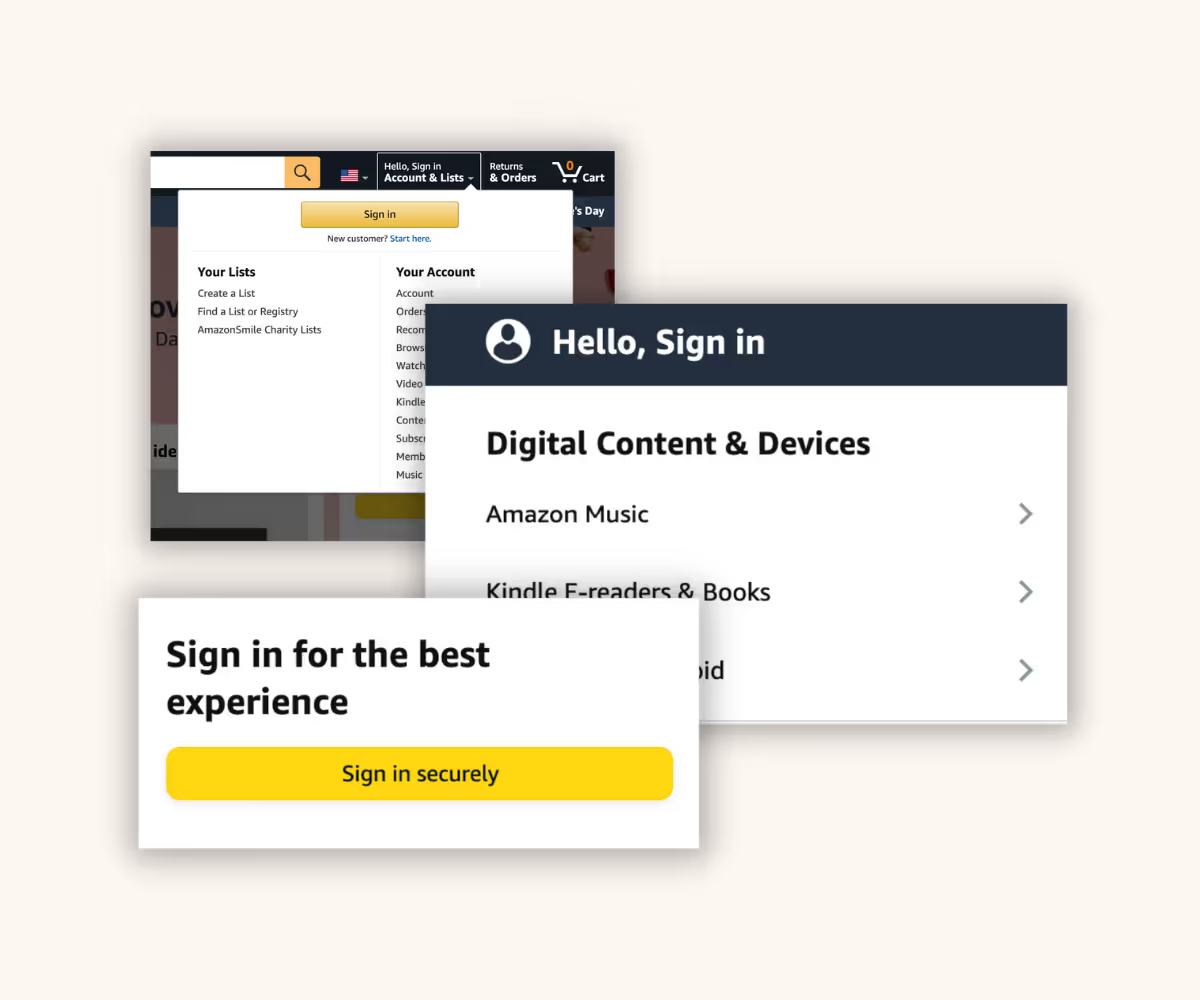
There are CTAs sprinkled all over Amazon's website. In the image above are a few examples prompting users to sign in for the best experience.
Sometimes, people will come to your site knowing exactly what they want, but sometimes, they're just willing to browse. Internal links such as "recommended for you" or "similar products" could help to send those users to the pages they are more likely to engage with.
Internal links are designed to help your users find the content and information they are most likely to need or want. They're also a powerful tool for SEO and a lot of internal links on your site signal search engines that there's more rich content available on your site. This can help get more pages of your site crawled and indexed faster.
The text links that you can find on almost every website are a great way to improve your site's usability and help users find additional information around the topic they are exploring. While hyperlinks are not necessarily at the core of website navigation, they're still an important tool to steer both human visitors and search engine robots in the right direction.
.avif)
Internal links on Amazon's home page take the users, for example, to different product category pages.
Website navigation is not just one thing. It's menus, links, buttons, and modules. It's also the tiny links you find at the top of most good website pages.
These links are called breadcrumbs because, like in Hans and Gretel, breadcrumbs prevents users from getting lost. Breadcrumbs allow users to easily navigate back to the previous page, the main category page, or back to the home page the same route they came from.
Breadcrumbs not only make a difference to users, though. They're also a significant factor in making your site easy to crawl for search engine robots, and that's good for SEO.

Breadcrumbs on a product page help users navigate back the same route they came from.
A sitemap is a must-have if you have a large, complex website. A sitemap shows what pages your website consists of and helps to categorize those pages.
It lets users on your website find the pages, categories, and sections they want to get to quickly and easily. Sitemaps are also mandatory for search engine optimization. So make sure you have a human-readable version for people and a crawlable XML version for search engines.
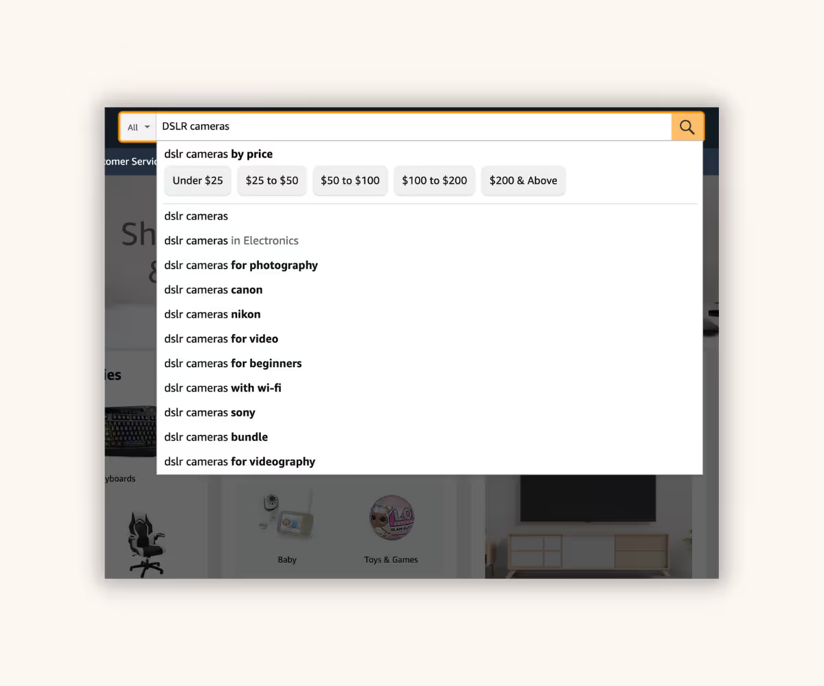
Having a well-designed website navigation system is a must, and it can help people find what they need on your site. However, sometimes, people already know what they want, and they just want to find it as quickly as possible. In such cases, a good search system is an excellent addition to your website. A search bar should allow for keyword and phrase searches and be as quick, accurate, and comprehensive as possible.

A search bar helps users to find specific products quickly. To provide users with accurate search results, the website must have a well-defined keyword/tag structure in place.
Website navigation has a huge role in making your website pleasant to use and content accessible. Below we are listing some of the best practices for website navigation.
Don't get too creative with your website navigation. People expect to find your navigation items at the top, the side, and the bottom of the page. Use internal links and call to actions to highlight the predicted next steps and fine-tune the user experience. On the other hand, you should devote time to planning your menu order strategically.
Before you start building your site, take some time to work out your site architecture. A little planning can make your next steps so much easier, and of course, will make it more pleasant for your customers to use your site.
Place the most important content above the fold and keep it visible when possible. Using elements like hamburger menus should be considered carefully and only when necessary. This might be the case, for example, with the mobile version of your website. But in general, keep everything visible whenever possible.
It's pretty self-explanatory that you should first show the essential things on your website. Ask yourself, what is the primary goal of your website? And then, communicate that first.
Good ideas are, for example, to show the most popular product categories or products that are relevant for the current season near the top of your web pages. To know exactly which content to prioritize, it is recommended that you use some analytics tool to recognize your customers' most typical behavior models and points of interest.
Give people several ways to find what they need. It is crucial to keep in mind that the entry point to your website is not necessarily your home page. For example, a user can find and enter one of your interior pages via Google. People finding your site through different channels and sources must have an equally good user experience on your website.
Website navigation should be predictable. Therefore, you should use clear and descriptive labels in your website navigation links. Avoid using phrases like "click here" as it doesn't tell users what happens next, and thus, it's not very useful for people.
Website navigation should aim to reduce the cognitive load from your customers while browsing on your website. The more concise your navigation is, the easier it is for your customers to comprehend what they can do and find on your website.
Understandably, e-commerce websites with hundreds or even thousands of products have more complicated website navigation structures than smaller sites. However, finding ways to group products and pages into categories and subcategories is a massive help for the visitors and improves the usability of larger sites.
Bounce rate and time spent on your pages are metrics that affect how your website ranks in search engines. One way to improve these two metrics is to design your user journeys so that there are as few dead ends on your site as possible.
The same navigation structure does not always work optimally for desktop and mobile devices. As mobile website traffic accounts for over half of global web traffic, you must also keep mobile visitors in mind.
A page-wide horizontal navigation bar works well for desktops, but a different approach is needed when the screen size shrinks with the device. A typical mobile navigation practice is the usage of a hamburger menu. The hamburger menu gets its name from an icon that some people think looks like a hamburger even though it's just three lines stacked above each other. Anyhow, the purpose of a hamburger menu is to combine multiple navigation links behind a clickable icon which allows you to fit more links into a smaller space.
The main navigation menu is not the only website navigation element that should be optimized for mobile devices. Remember to make sure that your call to actions and text links are big enough and clickable on smaller screen sizes.
Don't neglect the testing and analysis of how your website visitors behave on your site. Tools like Google Analytics can reveal valuable insights on where people enter your site and where they drop off. Based on your analysis, you might find soft spots in your website navigation system and sometimes find low-hanging fruits to improve your website's performance.
When designing your website, start with the site structure and navigation. Of course, the other factors that distinguish great websites from good ones are important. Still, they are of marginal importance if a poor navigation system ruins the website's user experience.
Start by defining your site's key objectives. Once the main objectives are known, everything else starts to fall into place almost by itself.
Turn every item into lasting revenue. Explore TWICE with a free trial.