TWICE 2.0 — Coming soon.
Learn more about the update
A long time ago, a website was just a collection of static pages on the internet. They were mostly text-based, hardcoded, and not very interactive. Fast forward to 2022, and things have changed. A lot.
These days, websites can have thousands of pages. They can be used to share content, communicate, advertise, sell, and even run whole businesses. This means the question of how to structure a website is a little more complex, and site architecture is a slightly broader topic than they were somewhat 30 years ago.
Here’s what you need to know about building an optimized website structure, so your users can have the best possible experience and get your website ranked high on search engines.
The first thing before moving to build your website and all the individual pages is to know what website structure is and how it affects your site visitors' user experience.
Imagine if you were given an encyclopedia, but it wasn’t arranged in alphabetical order, and there was no index of information. You’d have hundreds or even thousands of pages of information but no way to find what you needed to know.
Website structure and site architecture are based on the same kind of structure we use to organize the table of contents in a book. A well-thought-out site structure is one of the factors that make the best websites stand out.
In a book, you might have parts, sections, chapters, and subsections. They’re all neatly laid out on a table of contents page, they follow a logical progression, and they have descriptive titles – so you can find what you need to know quickly.
Site architecture is the same sort of thing. It is a structure that allows you to organize your site’s many pages into a hierarchy, with the more general information at the top and then subsections that deal with ever more detailed and specific information.
This allows your site users to go to the broad category they want to learn more about and then drill down through different levels until they find what they want. There are different ways to structure this, such as top-down or bottom-up, but the principle remains mostly the same.

One of the most important things you need to know about how to structure a website is that you probably need to do most of the planning before you start building the site.
This includes defining your most important pages, having a rough sketch of the URL structure and internal links, and planning how you want your users to navigate between various pages.
Modern Content Management System (CMS) platforms do make it easier to make changes later if you find that something else will work better, but it’s always a good idea to spend some time thinking about how you want to organize the information on your site before you start developing it.
A simple hierarchy flow chart is all it takes to get most of the design for your site architecture done in broad strokes. As you go through the design process, you might need to add or change things, but having a starting point makes everything much easier.
The best way to think of any website is to think of it as a pyramid.
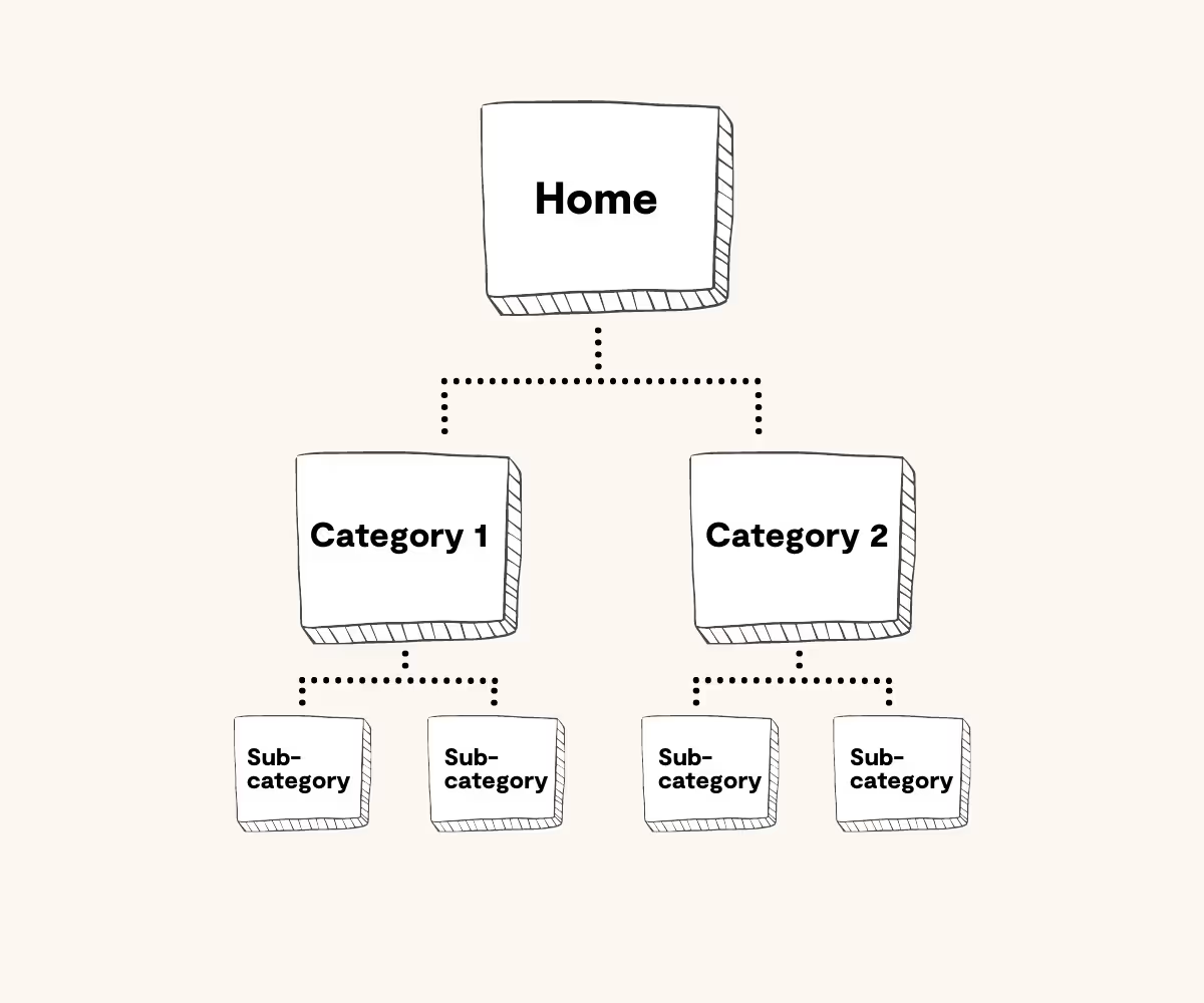
Right at the top of the pyramid is your home page. This is where most people enter your site, and from here, you can find links to all the other parts of your site. Next, there are likely to be:
Different types of websites might have very different architecture, but they will all contain most of these elements of site architecture. It’s a simple, universal way to arrange information that makes sense, which makes it easier to design your site, and more logical for people to use it.
There are over 9 billion websites in the world, so it’s safe to say that there is a lot of diversity on the web. However, even though most sites look different, if you peel back the surface, most are based on a few simple site architecture types.
Hierarchical structures are usually used on sites with a lot of information that needs to be organized for easy searching – like news sites or niche blogs. These sites have a website page structure that’s closest to the pyramid we mentioned above.
So, for instance, a news site might have a top-level category for sports, and then under that, they might have basketball, football, and ice hockey. Below that, they could have NBA, NFL, and NHL, and then below that, individual match reports, for example.
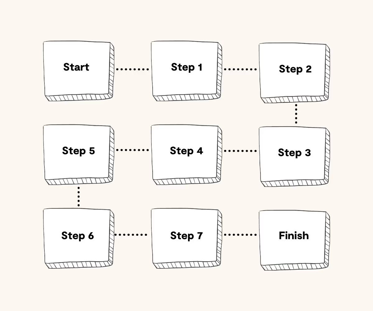
Sometimes, when you are building a website, you want to funnel people to a specific area based on their choices. So you might start with a choice that limits the next level of options available, and then the next, and so on.
This is useful if you want people to make a single choice or for sites where the optimized site structure will be used for onboarding new customers. You want the user to follow a more linear process, so you limit their next choices based on the choice they make at each step.
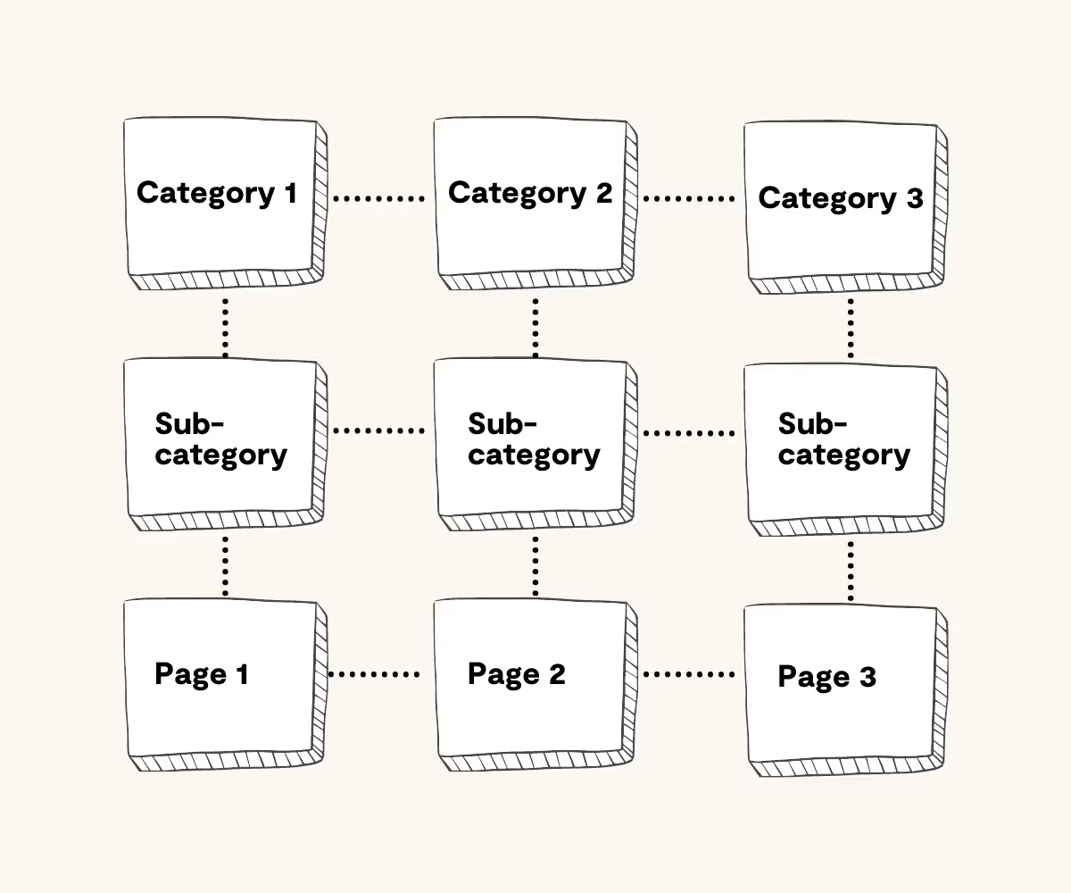
Matrix-type structure is one of the most common on the internet – and popular for e-commerce websites and large sites, where people are as likely to know what they want as they are to be browsing.
This kind of site architecture is like a massive open map multiplayer game where players are free to explore the game map with complete freedom. Users are in full control and can navigate back, forward, or sideways between different pages. The information is still structured based on categories, subcategories, and pages, but there are internal links to everywhere, from everywhere, allowing users to navigate between pages through clickable links.
While this kind of site might seem chaotic at first, it’s actually one of the best when you want people to "go down the rabbit hole". Just ask anyone who has started watching one cat video on YouTube and found themselves bleary-eyed at 3 AM, wondering what happened!
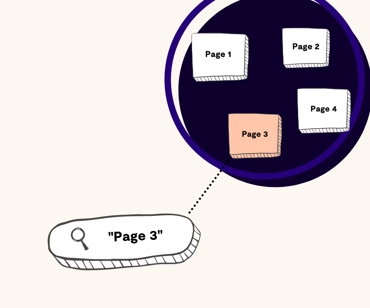
The database model is a great way to organize information if you want people to be able to search and find it logically.
Most of the process is search-driven. So you would land on the home page and then search for content using keywords and phrases.
This is another effective site architecture structure if you want to organize much information for easy retrieval. Think of Google, for example.
When it comes to the question of what's an ideal site structure, there's no one-size-fits-all. A lot of it depends on what you want to achieve with the site.
If you have a simple website that is simply going to be your business card on the web, a hierarchy-optimized site structure might work best. However, if you want to build a massive e-commerce website with thousands of product pages that you want people to browse, the matrix structure might work best.
This is why web design and site architecture design are about more than just the mechanics of building the site. You need to spend some time getting to know your ideal users or customers and how they like to use the internet. You want your site to be familiar and intuitive so they don’t get frustrated or confused.
A good website structure can improve the user experience dramatically and is generally considered one of the most vital aspects of building a successful website.
So make sure you don’t rush this step. Look at other websites. See what your competitors are doing and how their information is structured. This is one time that you don’t want to be too creative. If it’s working for the bigger competitors in your niche or industry, it will most likely work for you and help you reach your business goals.
Finally, when it comes to structuring a website, ensure you always have room for growth.
You might add more products to your online store and need to create more categories and subcategories. You might add new types of stories to your news site or blog, and need to create new topic groups to organize them in.
Your site structure should always allow for expansion on every level because if you do it right and your site becomes popular, planning your website's growth is the next puzzle you’ll have to deal with at some point – and it’s a great challenge to have!
Turn every item into lasting revenue. Explore TWICE with a free trial.